
CareerPlug sold hiring software to franchise owners and restaurant managers — people who don’t hire for a living. What they got was built on enterprise HR conventions. Rebuilding it around the job they actually had took four years, and a design team that didn’t exist when I started.
Context
What CareerPlug does
An applicant tracking system for small and medium businesses: post a job, collect applicants, screen them, interview, hire, onboard. Around 10,000 clients, most of them franchise groups and owner-operators.
Who was actually using it
Not recruiters. The person doing the hiring was usually the person also running the shift — a gym owner, a general manager, a franchisee with four locations. They hire in the gaps of another job, against turnover high enough that hiring never really stops.
Speed is the whole game for them. A good candidate who waits three weeks for a callback has already taken another offer.
My role
I joined as CareerPlug’s first designer and stayed four years, moving to Principal and picking up management as the team grew. I owned the research, the information architecture, the design system, and the hiring and management of the designers who came after me.
Where the platform was losing people
Building the case
A rebuild of this size gets funded on evidence, not on a designer’s opinion of an interface. I pulled from three sources that fail in different directions, so a finding that showed up in all three was hard to argue with.
Platform audit
I walked every core workflow end to end and screen-recorded it. Handing leadership a video of the real click path — not a slide describing it — moved the conversation faster than anything else I did that year.
Support and internal signal
I sorted support cases by volume rather than by severity, and interviewed sales, support and customer success. The highest-volume categories weren’t bugs. They were people asking the software to tell them what had just happened.
The internal teams also carry the objections that never reach product — the ones customers raise at renewal instead of in a ticket.
Contextual inquiry
Site visits with SMB owners and franchise operators, watching them hire in between everything else they were doing that day. This is where the feasibility constraints showed up — the ones no survey surfaces.
What we found
01 The platform spoke recruiter
Terminology, defaults and workflows all assumed a full-time hiring professional. The people using it called the same things by different names, and the mismatch cost them on every screen. This looked like a copy problem and was a positioning problem.
02 The system didn’t say what it had done
No confirmation on critical actions, no way to see the consequences of a step before taking it, and no record afterwards. A hiring manager couldn’t tell whether a candidate had been messaged, by whom, or when — so they messaged again, or didn’t.
03 Permissions were doing the work of structure
Productivity features sat behind user roles. In a business where the owner is also the admin and also the hiring manager, role-gating cost real time and bought no safety at all.
The map we started with
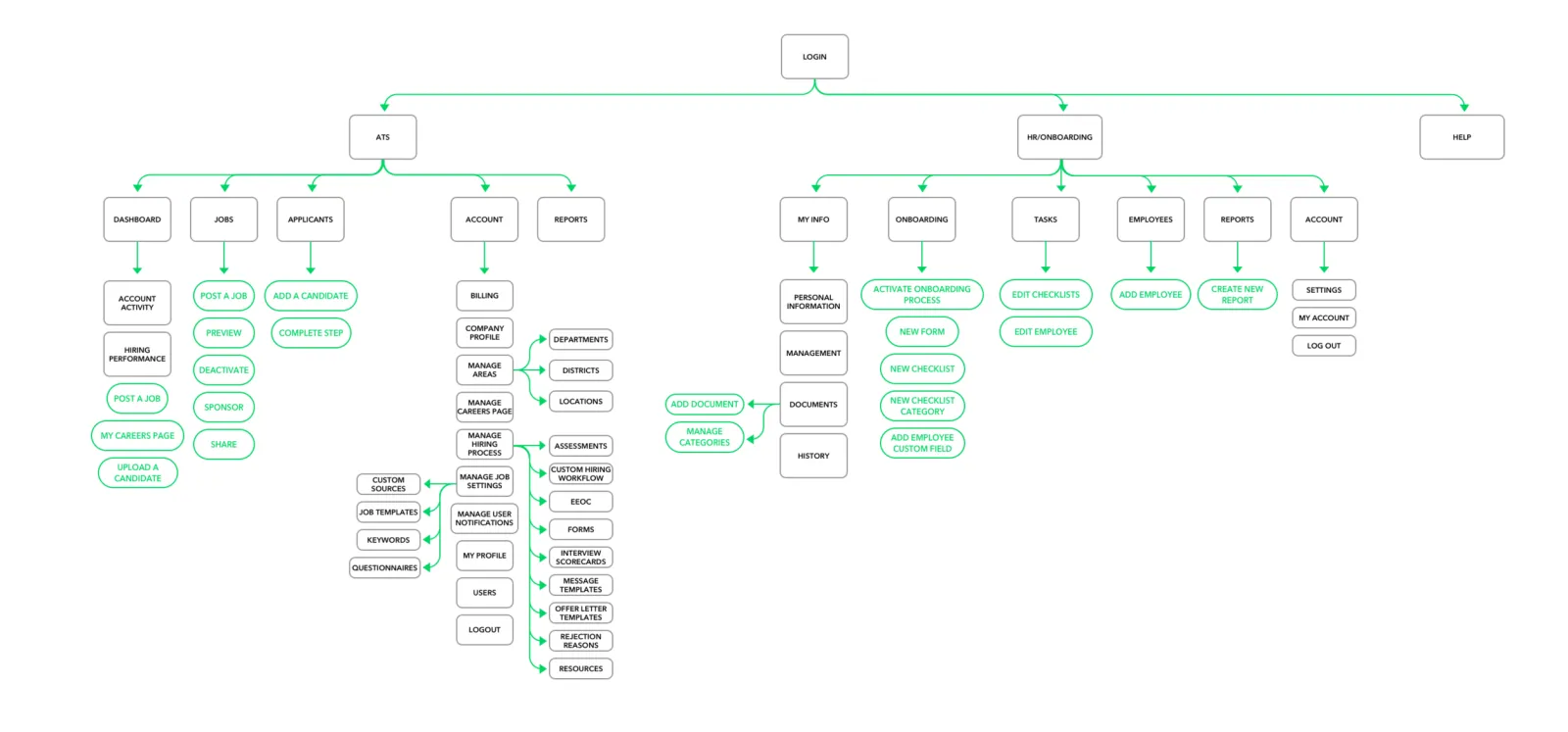
The platform split at the top level into two products — ATS and HR/Onboarding — and each one carried its own dashboard, its own reports and its own account settings.
Hiring someone and starting them is one continuous job for a customer. The software made it two, with a seam in the middle and two places to change your password.
 (view larger)
What the rebuild had to do
Three constraints
Framed as constraints rather than aspirations, because every one of them had a way to fail loudly.
01 Replace the infrastructure without losing the product
10,000 paying clients were hiring on the old platform the entire time we rebuilt it. Feature parity was the floor, not the ambition — and the floor is what a rebuild usually falls through.
02 Make it learnable by someone who isn’t in it daily
The measure wasn’t how fast an expert could move. It was whether someone who last hired in March could open it in September and know where they were.
03 Take steps out of the hire
Every day between application and decision is a day the candidate is interviewing somewhere else. Anything that added a step had to justify itself against that clock.
Rebuilding the foundations
A structure that matches the job
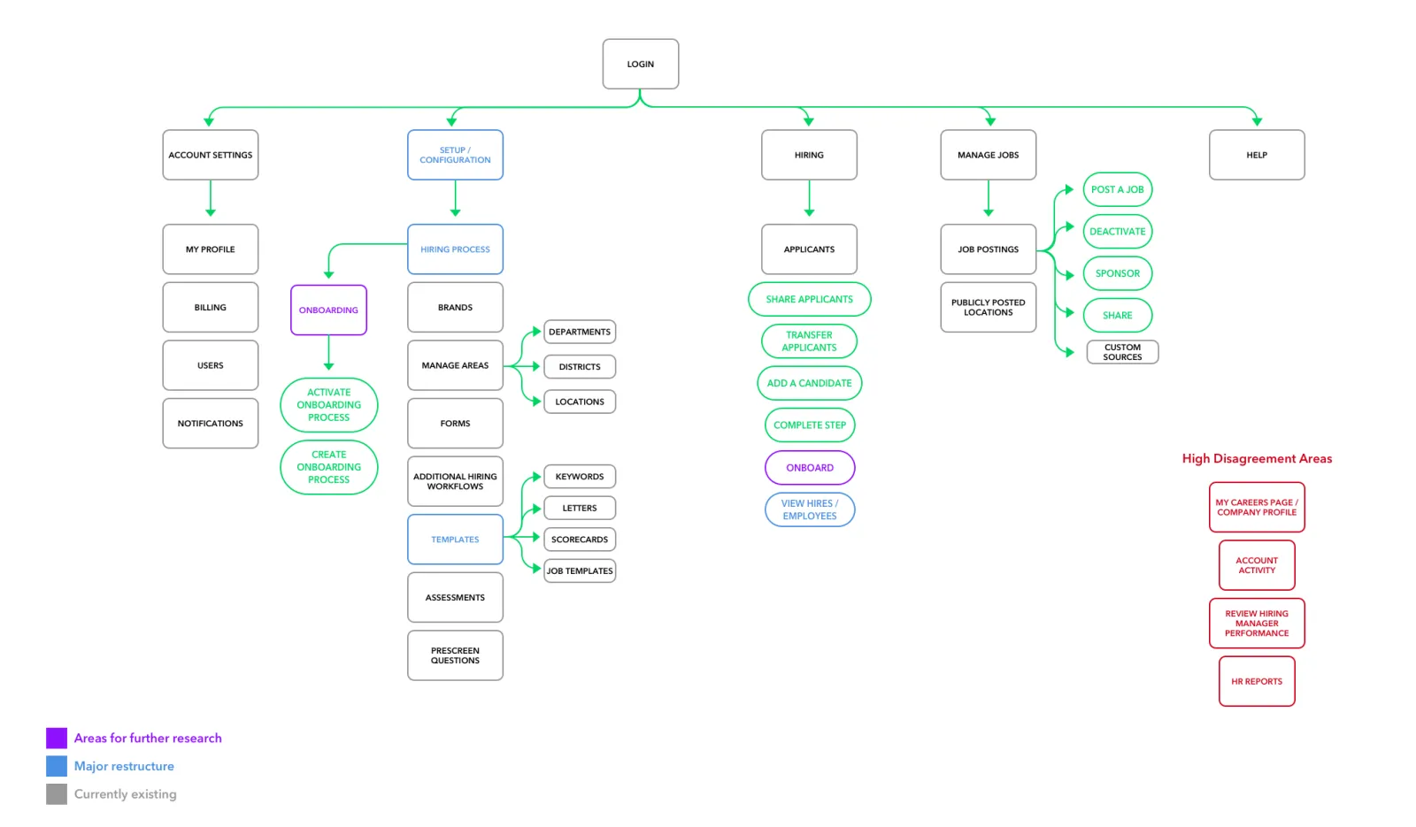
I ran card sorting with users and rebuilt the top level around what someone is trying to do rather than which product line owns it: Hiring, Manage Jobs, Setup, Account Settings, Help.
Onboarding stopped being a second product and became the last step of hiring, which is what it always was to the customer.
The four that never converged
Card sorting settled most of the map and flatly refused to settle four things: My Careers Page, Account Activity, hiring manager performance, and HR reports. Participants put them everywhere.
Why they stayed on the map
I marked them as unresolved rather than picking a home and moving on. A confident wrong answer in an IA is the most expensive kind — it gets built against, and every later feature inherits it. Some of them were still open when I left, and I’d make the same call again.
 (view larger)
A design system, because the arithmetic demanded one
One designer, a platform this size, and a rebuild measured in years — there is no version of that which ships screen by screen. The system was the only way the numbers worked.
What it covered
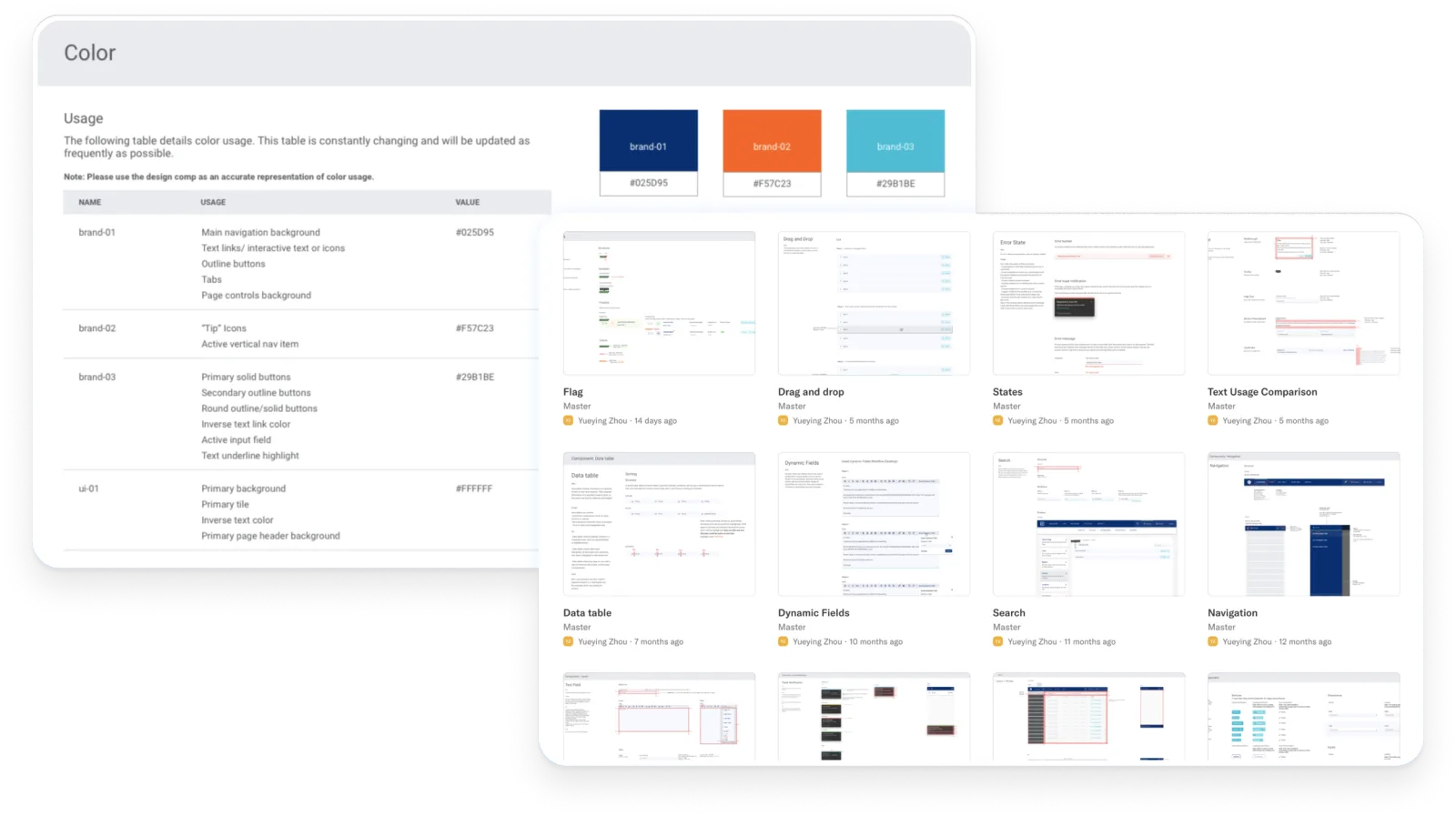
Every component in every state — default, active, disabled, error — with responsive and adaptive documentation.
Usage guidance written as do’s and don’ts rather than principles, because a developer at 4pm needs an answer, not a philosophy.
Dark, light and default configurations. Built in Sketch, versioned and distributed through Abstract.
The return wasn’t speed of design
It was that engineers started reading it. Patterns got implemented consistently without a handoff ritual around each one, and the back-and-forth that usually eats a design team’s week mostly stopped happening. That is the return on a design system, and it isn’t the one that gets pitched.
 (view larger)
What shipped
Applicants: from a list to a queue
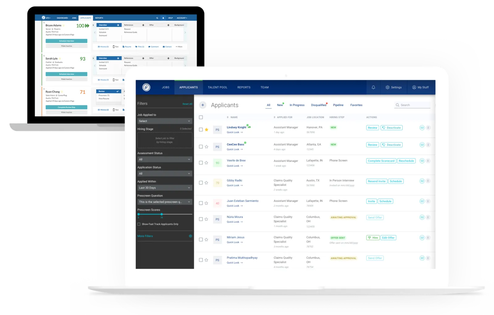
The applicant list is where these customers spend their time, and it was organised like a database table. We rebuilt it around the decision the user is actually making, which is almost always “who do I deal with next”.
Key decisions
Search that just works. Elastic search across first and last name, job applied to and location, with closest matches for mistyped data — applicant names get typed wrong constantly.
New first, always. Sorting new applicants to the top of the list cut review and response time by 5x.
Two actions, never more. Each row offers next and reject. A menu of options invites deferral; two options move the process.
The deciding data on the row — prescreen score, job applied for, location, contact — so the common case needs no navigation at all.
 (view larger)
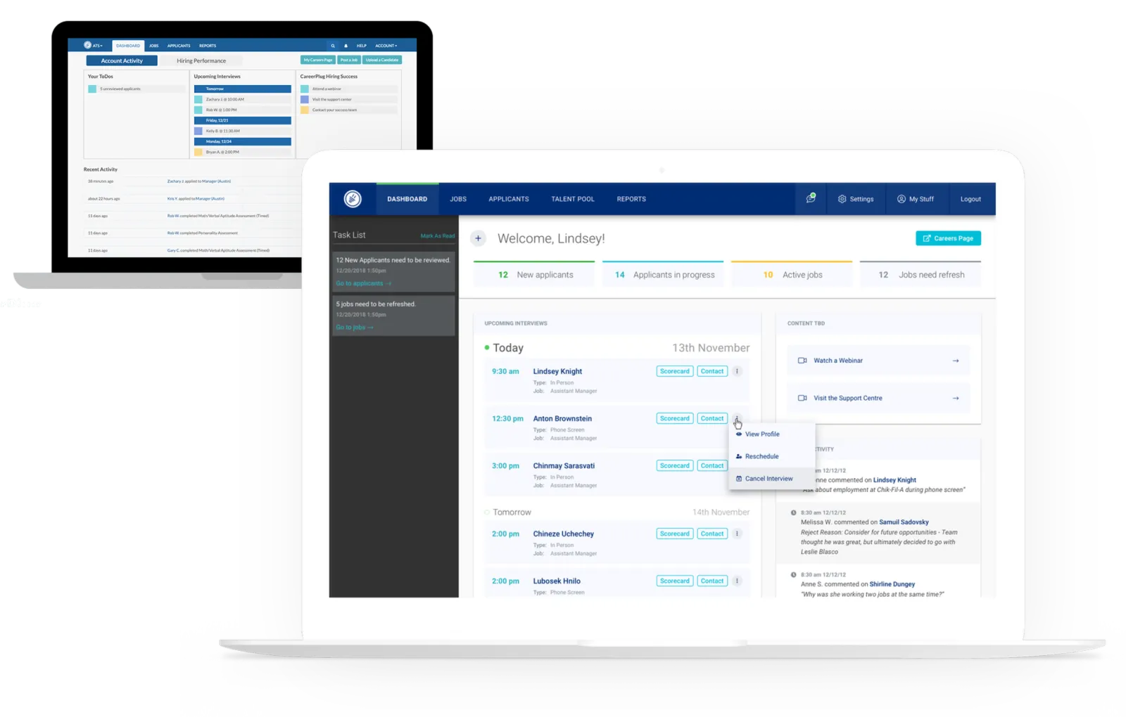
A dashboard that does something
The old dashboard reported. CareerPlug’s customers don’t open software to be informed; they open it in a ten-minute gap to get something off their list.
Key decisions
Schedules: a weekly view of pending and upcoming interviews, tasks and todos — the thing they came to check.
A scoreboard of high-level metrics, so the health of a hiring process is legible without opening a report.
An activity log of system and user actions. This was the direct answer to the second research finding: the platform now says what it did, and who did it.
 (view larger)
Texting, because email was losing the candidate
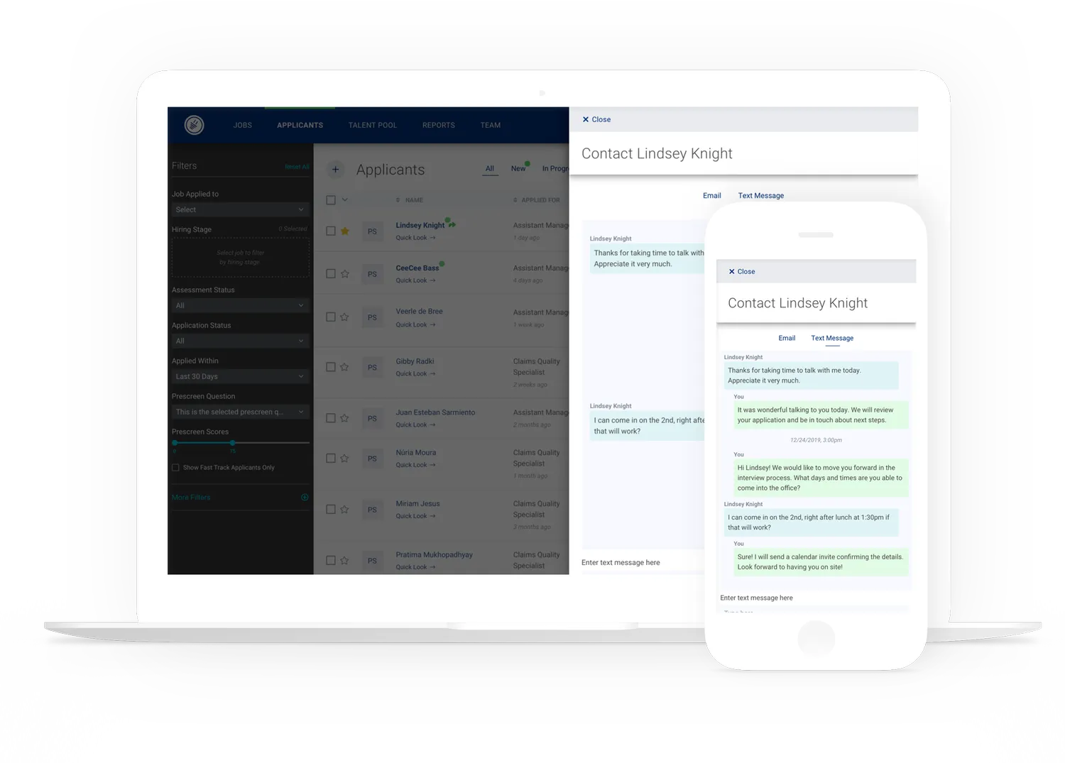
The clearest bet of the rebuild. For 8 out of 10 jobs, email was too slow for the market these customers hire in. Our research put text messages at 4.9x the open rate and 7.5x the reply rate.
Adding a whole messaging channel to an ATS is not a small ask. The number is what bought it.
Key decisions
Dynamic templates that autofill schedule, candidate and job details, so a manager sends in a few taps rather than composing.
Sent manually, scheduled, or fired automatically from a step in the hiring process — the same message, three levels of effort.
The full conversation history is always recorded, with the sender named. A shared number where nobody knows who said what is exactly how a small team drops a candidate.
 (view larger)
The text recruiting feature is fantastic. It’s simple, gets a fairly immediate response (unlike voicemail), and it’s considerably faster than any other option.
Impact
Hire in 7 days
The metric the business was actually run on, and the one the customer feels.
7 was ~25
Days from application to a hiring decision
5x
Faster applicant review and response
10k+
SMB and franchise clients hiring on the platform
Prior to using CareerPlug, my turnover rate was very high, around 75%. Trying to find the right people was a real challenge. Now that I am using CareerPlug, my turnover rate hasn’t exceeded 20%.
The two results without a number on them
Both were real and both were tracked as directional rather than precise. I’d rather say that than quote a figure I can’t stand behind.
Support volume moved into the product
Streamlined workflows, in-app guided walkthroughs, onboarding and contextual tips took a visible bite out of the “App Issues” support category — one of the high-volume ones when we started. The tickets didn’t get answered faster; they stopped being filed.
The team shipped above its size
With a versioned, distributed system in place, a design team of two was shipping against a full platform rebuild. The documentation carried the load a larger team would otherwise have carried in meetings.
What I left on the table
Terminology
We fixed the worst of the recruiter jargon by judgement. The systematic terminology testing this product deserved never happened, and it was the single highest-value research I never got to run.
Administrative access
Role-gating got better and stayed more restrictive than the SMB reality warrants. The permission model still assumes an org chart these customers don’t have.
Evaluation and automation
Applicant evaluation criteria were still ours rather than the customer’s — configurable scorecards were the obvious next move. So was pushing more of the hiring workflow into automation, now that there was a structure worth automating against.
Reflections
01
Go high fidelity earlier than feels responsible. Low-fidelity concepts didn’t work with this audience — an owner-operator shown a wireframe evaluates the wireframe, politely, and tells you nothing. Prototypes that looked real got real reactions, and the extra hours up front bought better decisions than a cheaper artefact and a second round would have.
02
I went in wanting to standardise, and standardisation was the wrong instinct. SMBs hire in genuinely different ways for genuinely good reasons, and a flexible tool that supports several workflows beat the one well-designed path I was convinced they all needed. Designing for that variety is harder and it is the job.
03
The highest-leverage design work I did at CareerPlug was hiring. Going from the only designer to a team meant most of what I made in the last stretch was scaffolding — the system, the documentation, the critique habits, the case for why any of it mattered — rather than screens. It is a harder thing to put in a portfolio and a better thing to have built.